To understand how your stats compare to those of the rest of the TechDisc users, navigate to the Globe icon tab on www.TechDisc.com/Throws.
First, consider the throw type to compare. For example, if you are interested in comparing your forehand throws to the forehand stats of the population, select “forehand” from the dropdown to only see forehand throws from the population, and ensure you’re filtering to only forehand throws using the above Filter box.
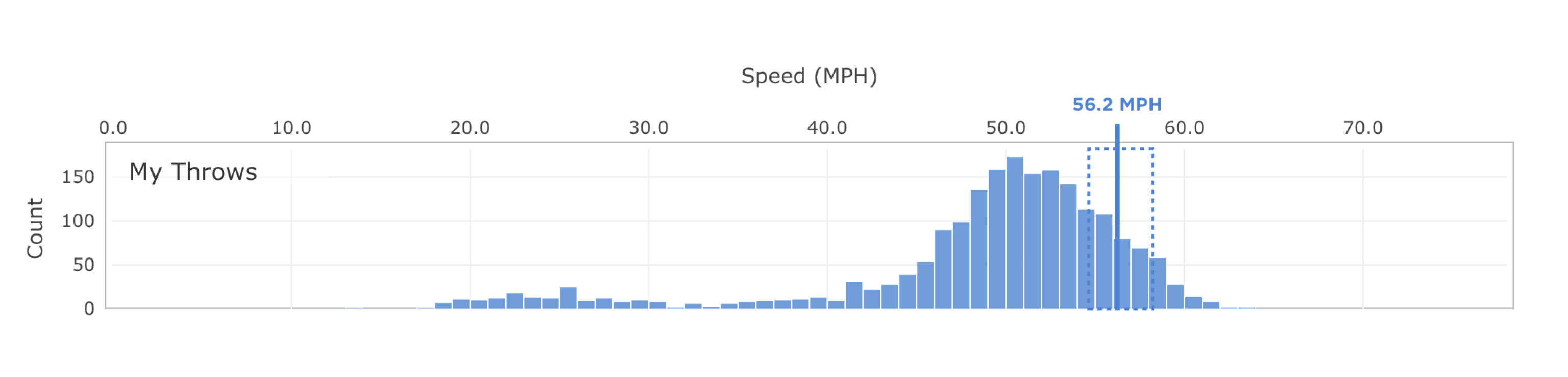
Plot 1: My location in the population
This plot introduces a few concepts in order to better help you evaluate your statistics in the context of the TechDisc population.
The top histogram displays your distribution of throw speeds (just like on the Plots tab), and additionally marks the 80-95th percentile with a dotted box. The vertical line marks your functional speed, or the average speed of all throws within the 80-95th percentile range.
The bottom histogram shows the distribution of functional speeds for users in the TechDisc population. Comparing your functional speed with this histogram shows where you fall in the TechDisc population.

In order to calculate reasonable estimates for population statistics, we include data for the previous six months and exclude users with fewer than 100 non-hidden throws of that throw type.
The final part of the plot defines speed brackets that allow us to group users by their functional speed. Each user falls into exactly one bracket. Hovering over the colored boxes shows the part of the distribution included in that bracket.

Knowing your functional speed and speed bracket allows you to start asking as “is my spin higher or lower than most other players in my speed bracket?” and “do others achieve a higher distance with the same speed?”
Plot 2: Summary chart of each metric
This section offers a high-level summary of your metrics compared with the TD population, broken down by speed bracket (see Plot 1).
For each metric, the plot shows the average functional metric value plus/minus one standard deviation for TechDisc users in that speed bracket as horizontal bars. Your functional metric value is marked with a vertical line that includes a dot to mark your speed bracket.

We calculate the functional values for each metric differently to adapt to their specific use.
Metric | Functional metric calculation |
|---|---|
Spin | Average absolute spin of a user’s 80-95th percentile absolute spin values. |
Wobble | The average wobble of a users throws that lie in the 80-95th percentile for distance. |
Hyzer Angle | The average hyzer angle of a users throws that lie in the 80-95th percentile for distance. |
Nose Angle | The average nose angle of a users throws that lie in the 80-95th percentile for distance. |
Launch Angle | The average launch angle of a users throws that lie in the 80-95th percentile for distance. |
Distance | The average distance of a user’s 80-95th percentile distances |
The above information is also available via the info icons next to the metric name in the plot.
These summary plots can offer high-level insights into how you differ as a player from others across speed brackets. For example, if you find your speed and spin match your speed bracket, but your distance is lower than the bracket while the nose angle is higher, it’s possible that working on nose angle might be a useful path forward to improving distance.
Plot 3: Detailed comparison for one metric
The final plot on this page offers a deeper dive into any particular metric using a boxplot. Use the dropdown in the title to find your metric of interest.
Briefly, a boxplot (also known as a box and whisker plot) describes some details of a distribution of values (for example, skewedness, spread, etc.).

The box itself marks three values:
The first quartile Q1. Also known as the 25th percentile. Left edge of the box.
The median. Middle vertical line.
The third quartile Q3. Also known as the 75th percentile. Right edge of the box.
The whiskers extend from the left and right of the box and show two additional values:
The minimum value excluding outliers. Specifically the smallest data point that is larger or equal to Q1 - 1.5 * IQR, where IQR = (Q3 - Q1).
The maximum value excluding outliers. Precisely, the largest data point that is smaller or equal to the Q3 + (1.5 * IQR).
Currently we do not plot outliers.

The boxplot above shows six boxes: one using data from each speed bracket (outlined boxes) and one drawn using your 80-95th percentile throws data (shaded box). For each speed bracket, the boxplot captures the distribution of functional metric values for users in that speed bracket. For your data, the box captures the distribution of throws within the 80-95th percentile of throws based on the appropriate metric. The vertical dotted line marks your functional value for the given metric.
This plot can be used to understand more deeply the distribution of your metrics for your top repeatable throws, and how they compare to others across speed brackets in the population.
Was this article helpful?
That’s Great!
Thank you for your feedback
Sorry! We couldn't be helpful
Thank you for your feedback
Feedback sent
We appreciate your effort and will try to fix the article